Getting to the Right Medical Care Center
Project Brief: Washington D.C. has the longest emergency room waits in the country. Particularly, MedStar Washington Hospital Center wants to improve their ER waits. They want a mobile app that will allow their patients to know how long they have to wait for, and will give them something to do while they wait. In a 2 week sprint, I focused on user interviews, persona creation, wireframing, and prototyping to create a mobile application to improve the current ER experience.
Methodologies: Agile Workflow, Competitive Analysis, Field Research, Persona Development, Rapid Prototyping, Usability Testing, User Interviews, Wireframing
Tools: Adobe Photoshop, Axure, Google Forms, Sharpies
Project Team: Jim Bogden, Mina Farzad, Michael Franco
SETTING THE BOUNDARIES
We knew from the project brief we had to achieve three things for the patient:
- Facilitate — Ensure patient and relatives could reach MedStar care promptly.
- Inform — Notify patient and relatives in regards to stage of care process.
- Entertain — Provide patient and relatives with something to do during the hours of wait at the E.R.
There were also several constraints we had to keep in mind while working to solve this problem:
- Had to stay within the MedStar system
- Working primarily with MedStar Washington Hospital Center
- Several legal limitations regarding access to patient information
SURVEYING THE DEMOS
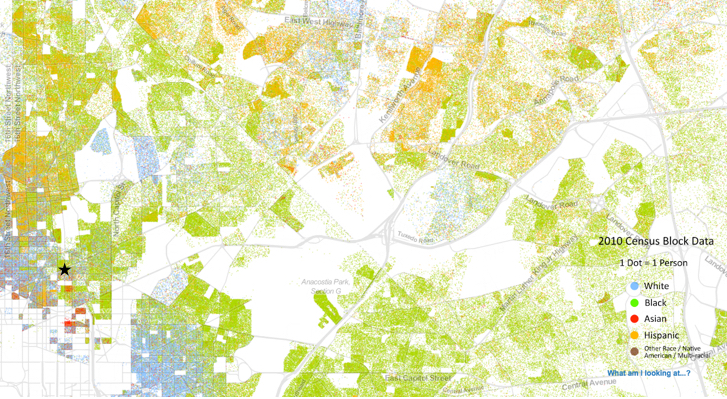
Since we were working with a very particular demographic we had a fair idea of the type of users we were working with. From research we knew our users were:
- Older
- Low-income
- Prone to compound medical problems
I created a survey to obtain sentiment regarding emergency room periods. From this I was able to draw the following conclusions:
- Many people do not consider other options aside from the emergency room for their immediate medical needs
- People found that they were never actually well informed of their position along the emergency room process
- Communication tended to be spotty between staff and patients
OBSERVING IN THE WILD
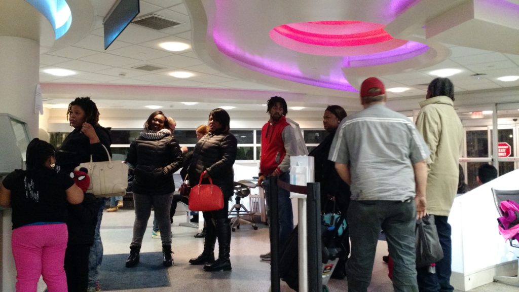
To get a closer look at our users, I visited the MedStar Washington Hospital ER room. I talked to whichever folks I could about their current experience. From my observations and conversations it was very clear that:
1)Many people were there for non-life threatening issues
2)Most people spent time on their smartphones (playing games in particular)
3)People found it difficult to not only get to the ER, but to direct others looking to join them
GIVING A FACE TO THE CAUSE
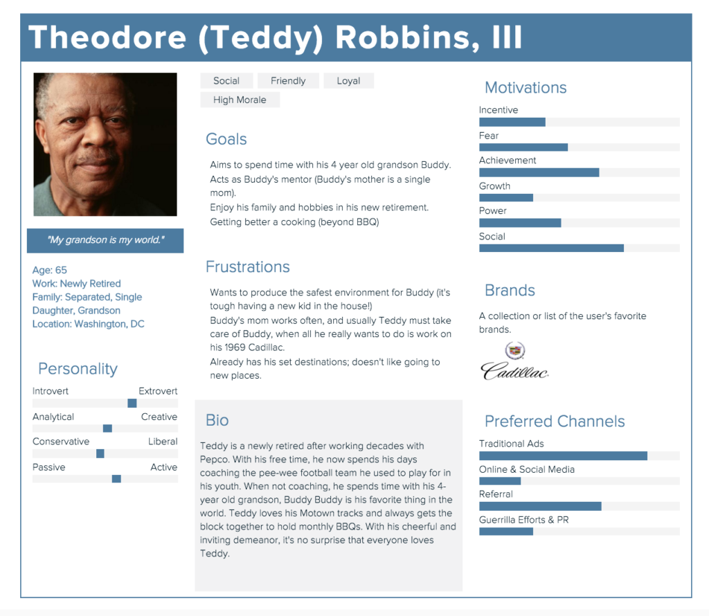
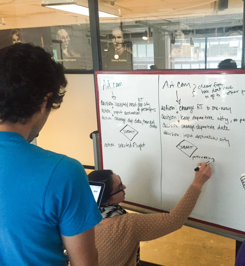
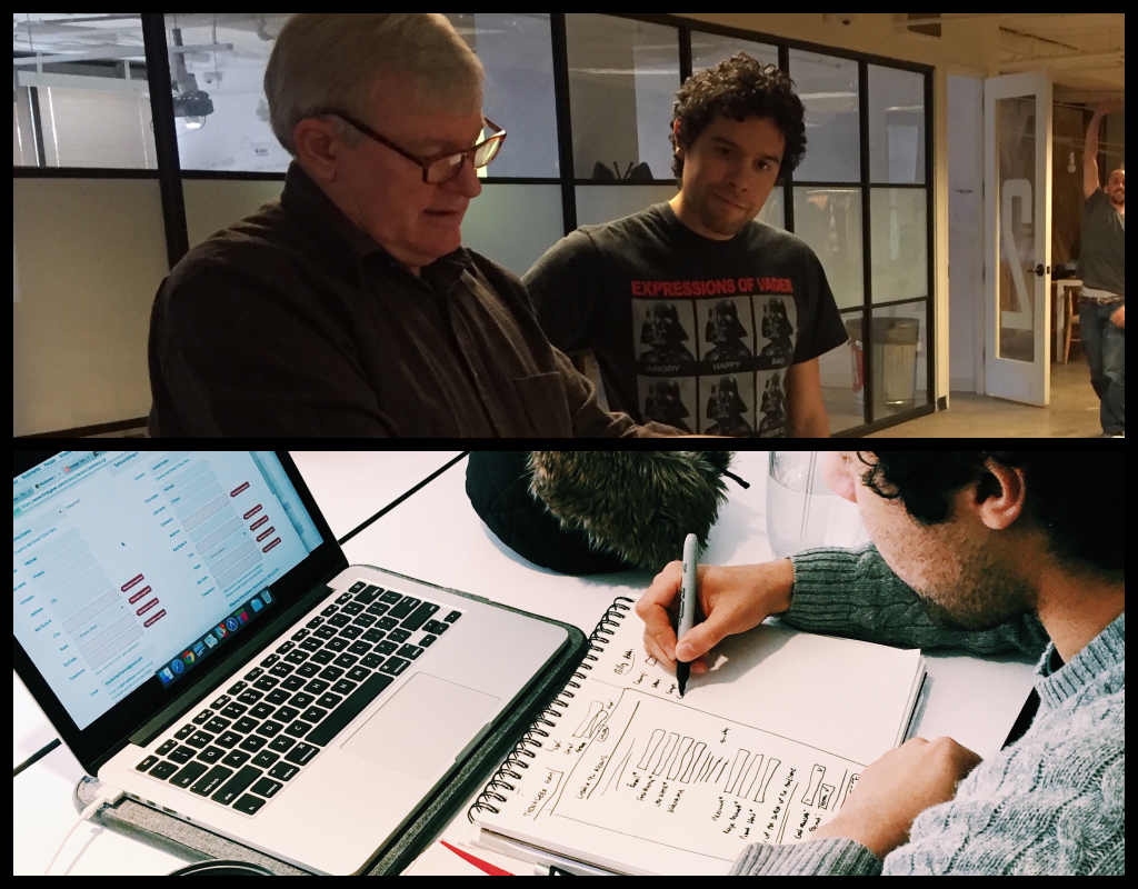
Based on my research and the survey results, I was able to develop a comprehensive persona for our application. This persona would aid us in determining design choices as we moved forward through the project. Further, I helped my teammates in creating alternative personas, pushing for details to make them as realistic and complete as possible so we would build our app around these stories.
GET THEM THERE FAST
We held a design studio to start figuring out how we could solve for our personas when he or she would be placed in an emergency situation. We kept several constraints in mind, such as the fact that more of the users in our area were Android smartphone owners, for example.
From our research, we knew we had to achieve two major items for the patient:
- Provide real-time information for users to determine their quickest and best care option within the MedStar system
- Provide details about what to expect on the journey throughout the entire emergency care system
Although research also showed that patient satisfaction is likely to be improved through environmental measures that address items such as comfort, people already have smartphones to entertain themselves. Thus, we gave priority to the two items stated above.
MAKING THE RIGHT CHOICE AT THE RIGHT TIME
One strategy to reduce ER wait times within the MedStar system was to divert less-severe cases to prompt-care centers, which are often quicker and more convenient. We found that many users are not aware of this option, what services are available, or where centers are located.
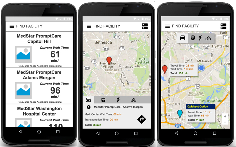
Our first drafts involved providing a list of all available care options in the area, organized by proximity. Presenting the wait times, patients would have the ability to determine which would be best.
After user testing, it became apparent that the locations had to be ordered by time. However, there were two sets of time to address:
- The time it takes to get to the ER
- The time a user has to wait at the ER until being admitted
Further, users wanted to see how the locations spaced out visually, rather than in a list.
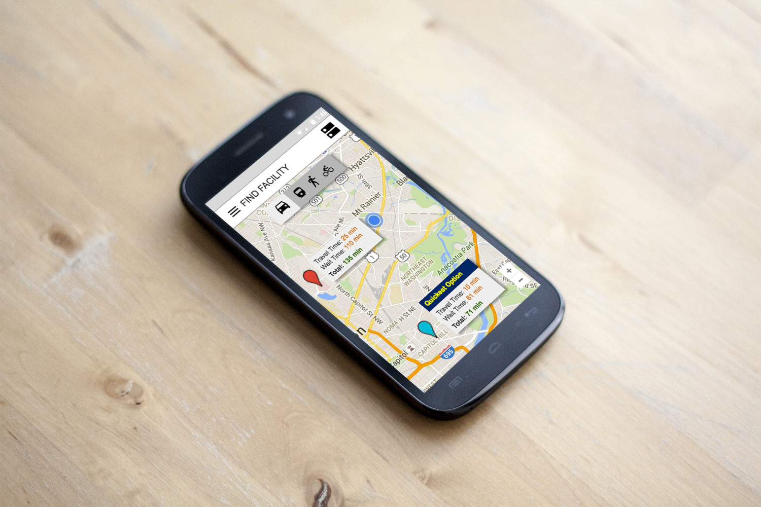
Our final design automatically presented the user with the best option (shortest waiting time and shortest transportation time combined) on a map upon opening the app.
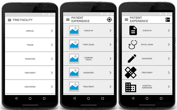
WHAT DO I DO ONCE I GET THERE?
Our in-person interviews confirmed researchers’ recommendations that patient satisfaction could be improved by empowering the consumer with as much information as possible about the medical process. Such information would help to reduce anxiety and increase patience.
In regards to the list of patient symptoms, we originally started off with a basic list for users to review. It was quickly discovered in user testing however that:
- Users didn’t understand the medical terms
- Users wanted to know average times for each phase of the medical care process
Through more testing we worked on clarifying the procedure, working on informing the patient as best as we could through the list.
VIEW THE FINAL PROTOTYPE BELOW.
FUTURE CONSIDERATIONS
The next stage for this app would be to provide step-by-step guidance about the various tests and doctor visits a patient could expect to encounter along the way, in the patient’s preferred language. The app could be configured to send text messages to concerned family members each time a key milestone is reached. Ideally, this information would be tailored to each individual’s specific condition or reason for visiting the ER.

