
Keeping Track of the Data – Web Harvesting Dashboard
Project Brief: Our design team was asked to develop a dashboard for current customers of a proprietary web harvesting product. The dashboard would provide customers with their monthly data usage. Currently the product has no visual interface. Customers use the command line to access product features. When it comes to assessing usage, customers must contact their account manager. As is evident, a visual dashboard would save time for both customers and account managers. My role was to research and design an appropriate interface for this new dashboard.
Methodologies: Competitive Research, Persona Development, Rapid Prototyping, Stakeholder Interviews, User Journeys
Tools: Axure, Sketch, Pen, Paper
Team Role: Researcher, Wireframes, User Testing, Protoptying
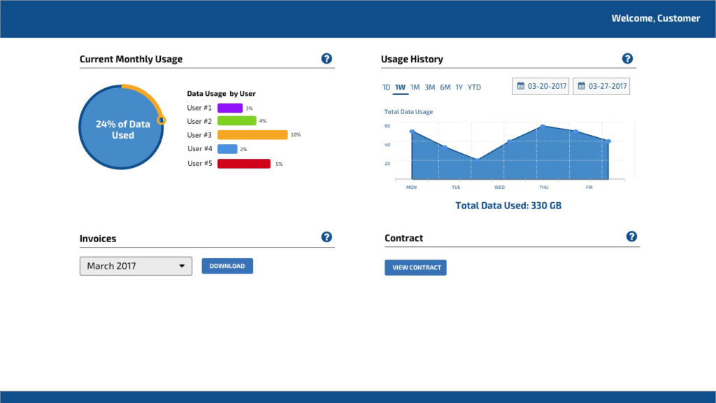
Tracking Data Usage
My first task was in understanding the existing workflows for determining customer usage. We asked our account managers to walk us through their typical process. We also asked about the common complaints received from customers. Through this investigation we had an idea of the elements to include in this new dashboard:
- Total data usage per contract
- Monthly data usage
- Customer account information
- Customer billing information
We began to research dashboard designs that conveyed usage metrics over a period of time. I reviewed platforms such as those from major cellular providers (i.e. Verizon, AT&T), server providers (i.e. AWS), and B2B platforms (ie. Google Analytics, Google Doubleclick). From these I could draw the following conclusions:
- Majority of the screen real estate was given to the main data usage chart
- Generous white space was provided between elements as to not overburden the user
- Navigation was kept to a minimum (or not even provided)
With these items in mind, we began working on several iterations of the dashboard.
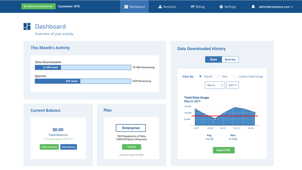
Addressing “Scope Creep”
It was not long before there was serious “scope creep”, or repeated requests for new features to be included in the initial release. Over the next couple of weeks we went through not one, but two product managers…and then none at all. Requirements kept changing throughout the transitions. As a result, we kept modifying and adding to the designs as required. As a result, the dashboard became a complicated application, including such items as billing systems and user management. This was overkill, when the initial ask was just a dashboard showing data usage. The lead developer finally took charge, and together we trimmed the application back to its essentials. Only then did we have a stable design for usability testing.
Testing, Testing and More (Usability) Testing
Since we did not have direct access to test our users, we tested our next best resource: our account managers. We repeatedly tested our designs to ensure the appropriate workflows were addressed. Below is a sample of the results from one usability test:
Results: The current mockups fulfill the account managers’ job requirements in their most basic form. Navigation through the mockups was intuitive enough to identify and complete the essential workflows. More friction existed in particular details of the dashboard such as the verbiage used (i.e. accounts vs. users. vs. customers), definitions (i.e. is a trial account a separate account type, or is it an account status?), and information illustrated (i.e. is the history graph conveying the right information in a sensible way?). Other information, such as sub-account details, were found to be extraneous and can be removed for the initial release.
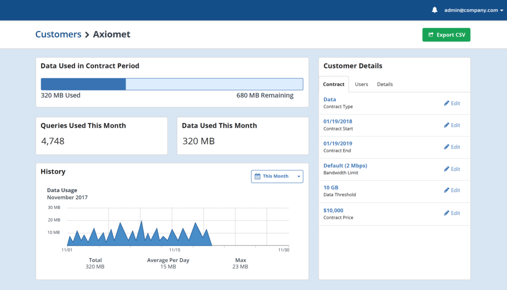
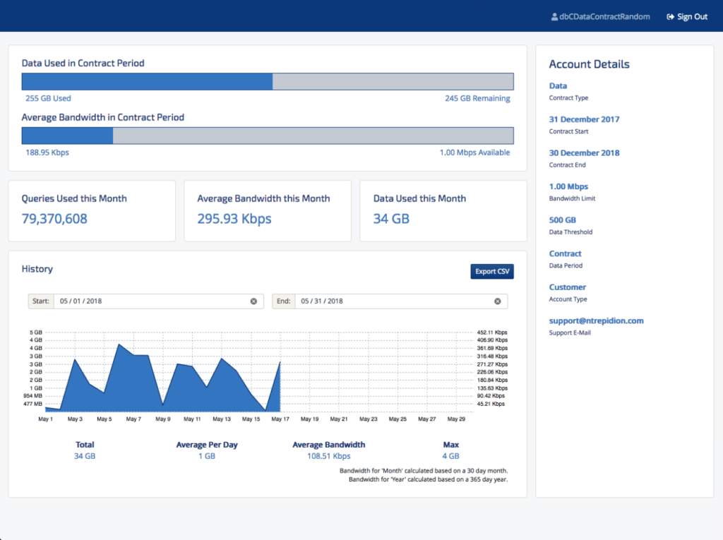
Finally We Arrived
With every usability test, our designs continued to improve. We ensured that the overall design fulfilled our users’ workflows, and were meeting product requirements. We began working with the front-end engineers in bringing the designs to life. The iterative process continued as other design details were discussed and edge cases considered.
We were ecstatic with the final result (and we kept it to one page!).
The UI will be delivered with the release of the 2.0 version of the web harvesting software, scheduled for the end of 2018.