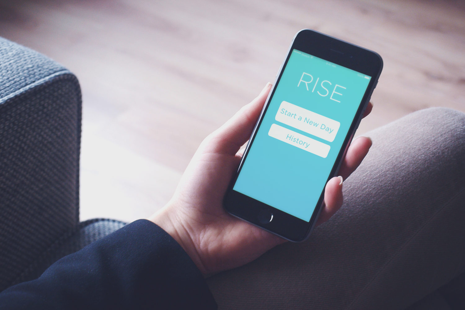
RISE Productivity Mobile App – Actually Finish Your To-Do List
SPRINT 1
Project Brief: Develop a mobile application in one week designed to improve a user’s productivity. Through my research I found that people faced too many confounding options in approaching their daily to-do list. I designed an application that provided users a way to successfully complete only the most important items on their list.
Methodologies: Affinity Mapping, Storyboarding, Rapid Prototyping, Usability Testing, User Interviews, Workshops
Tools: Marvel, Post-It Notes, Sharpies
Project Team: Individual Project
SPRINT 2
Project Brief: Design and code a landing page for the mobile app designed in Sprint 1.
Methodologies: Usability Testing, Wireframing
Tools: Atom, Invision, HTML, CSS, Javascript, Sketch 3, Twitter Bootstrap
Project Team: Individual Project
WHY DO PEOPLE NEVER FINISH THEIR TO-DO LISTS?
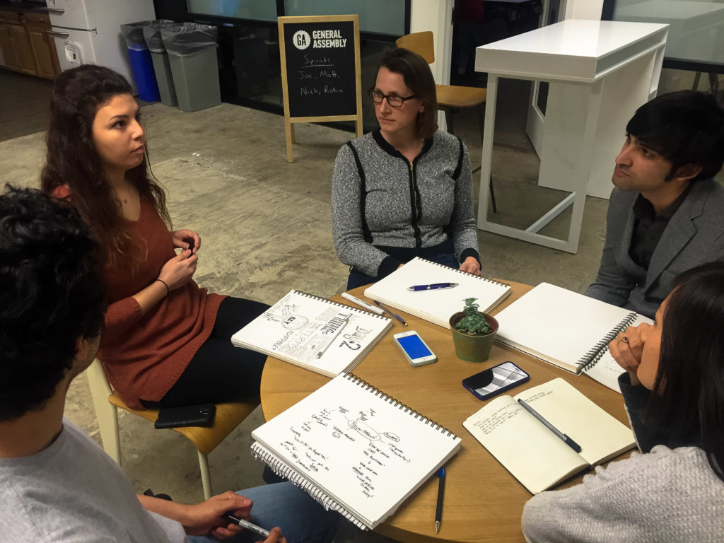
I had to understand the elements that made up productivity. Through an initial workshop session, I understood there included subjects of motivation, procrastination, and focus. However, even the most motivated, advanced and focused person may still fail at the execution of a task. Thus in the same workshop, I looked to break down the elements of execution. Elements included:
- Shame – A feeling of guilt for not being able to complete a task
- Accountability – Much easier to put a task aside if not being held responsible
- Feeling of Accomplishment – Knowing you’re getting a great benefit by completing the task
- Amount of Time – There could be too much or too little time to complete a task
MAYBE PEOPLE JUST NEED A LITTLE PUSH?
From this discovery process, I theorized that the likelihood of completing a task was increased by use of external suggestion. I believed creating a ‘smart’ module that could provide suggestions to the user for better completing a task would help solve the following issues related to the execution of a task:
- Reduce shame as it would provide knowledge on how to complete the task.
- Reduce time to complete the task, as it helps provide ‘shortcuts’
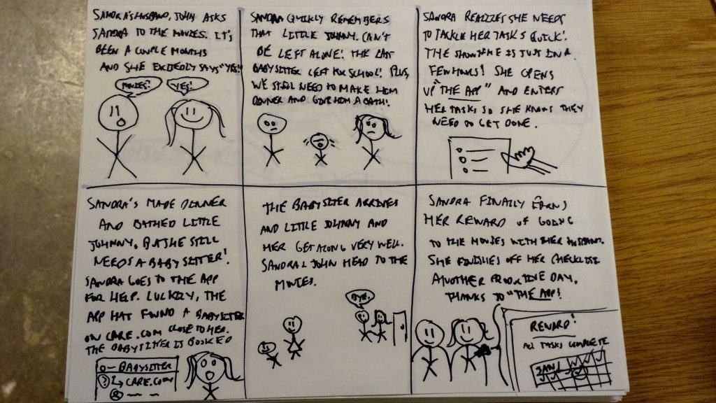
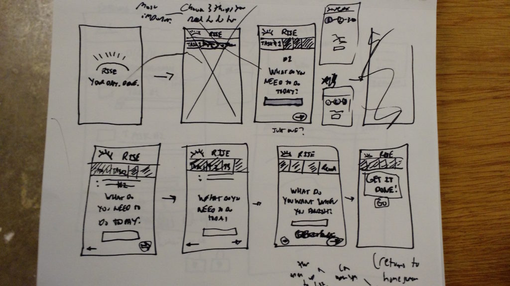
I illustrated a storyboard to ensure the logic of the app made sense. I also created several user flows to understand the choices the user would have to make in using the app.
UH-OH. TOO MUCH HELP ACTUALLY HURTS.
I am very glad I tested, because my theory of the use of an external suggestion module was flawed. The users I interviewed believed:
- The ‘smart’ module produced too much choice, thereby countering the purpose of the app.
- The use of a reward was ideal for completing tasks. It gave users something to look forward to.
If the external suggestion module could be simplified, then it could become useful. And now I had to find a way to include some reward system.
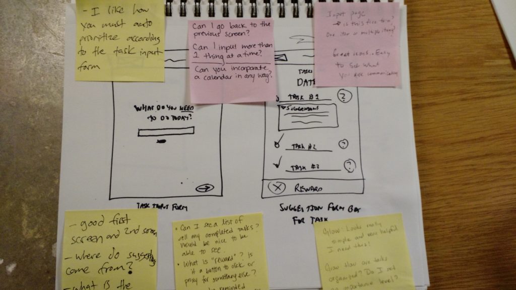
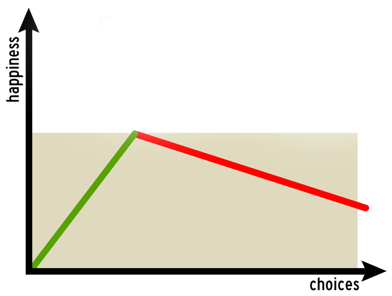
PREVENTING THE ‘PARADOX OF CHOICE’
Users would now be prompted with screens to enter only the three most important tasks for the day. The ‘smart module’ was also removed from the app. These decisions were based on the studies of the Paradox of Choice, as termed by Barry Schwartz. He says people find it harder to make a decision when there are more choices available to them.
To add extra incentive, users would now be prompted to enter a reward of their choice for completing their tasks.
THEN TAKING A FEW PIECES OUT….
The simplicity resonated well, as did the use of the reward. Users said the app was easy to follow and they liked they had to limit the number of tasks they entered. Another round of testing would provide another set of changes. Users said:
- The app felt like too much of a form.
- There should be more flexibility in the number of tasks to input
As a result of this testing, the user could now input up to three tasks maximum and this could be achieved on one screen.
FINALLY, SIMPLE ENOUGH
After a final round of user testing, users were receptive to the new task entry design, and did not find it as confusing as the previous 3 screen task entry process. They understood the design and the goal of the app.
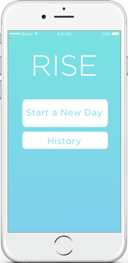
The final application design thus reflected the following:
- Constraints— The app only allows the user to input up to three items for their daily to-do list. This forces prioritization of tasks from the get-go.
- Motivation— The app allows the user to input one “reward” of their choice that they will gift to themselves upon successful completion of their task. This gives the user something to look forward to in completing their tasks.
- Visual Simplicity — The list of tasks is large, clear, and concise, making it easy to check items off and verify progress.
FUTURE CONSIDERATIONS – SPRINT 1
Business Partnerships for Rewards
The rewards feature of the app invites business partnerships. For example, say my reward was a small ice cream cone at Ben & Jerry’s. There could be a predetermined list to buy 1)cones, 2)sprinkles, and 3)Ben & Jerry’s ice cream at my local grocery store. After completing these 3 tasks, I could be rewarded with a free small ice cream voucher to redeem at Ben & Jerry’s.
Goal Presets
There may be a benefit to having preset tasks for common goals, such as getting to the gym. Selecting a preset would pre-populate a user’s task list with the most essential items to reach his or her goal.
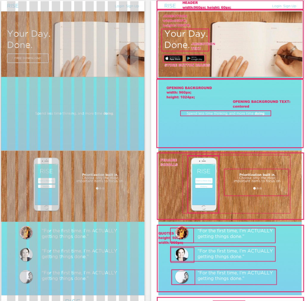
SPRINT 2 – DESIGN AND CODE THE LANDING PAGE
KEEPING IT SIMPLE
After a brief branding exercise, I understood that the landing page had to convey cleanliness, organization, and functionality. As the application promoted a more efficient day, the themes above had to be present in a minimal structure to allow the user to get on with his or her day. All information had to be presented in a swift manner.
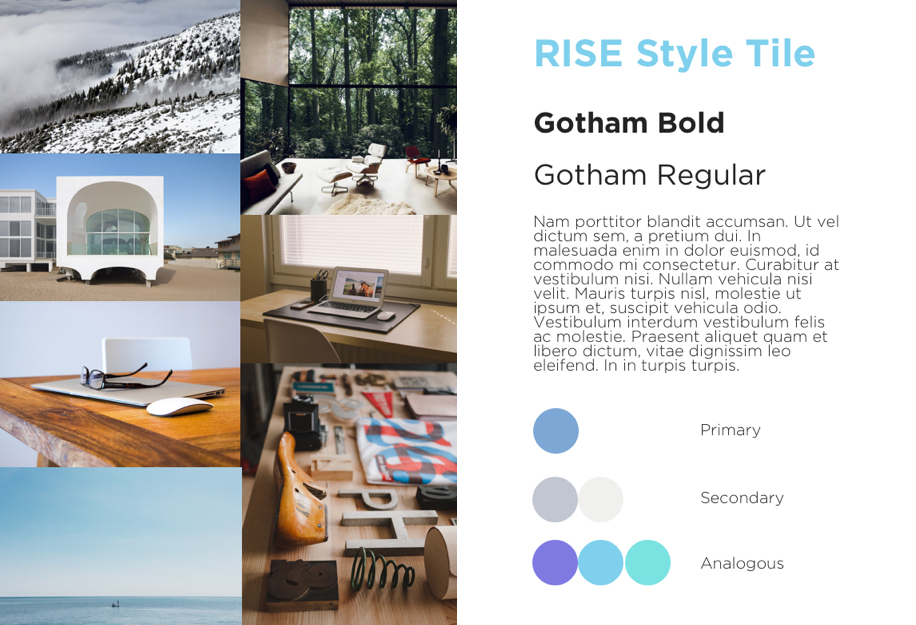
THE POWER OF BLUE
I researched photos that represented these ideas of cleanliness and organization. I constructed a moodboard to produce a visual basis for the emotions I was looking to express in my page . From these images I was able to create a color palette and style tile from which to base the visual aesthetic of the page. As you will notice, the primary color of the scheme is blue, a naturally calming color.
A CLEAN LAYOUT
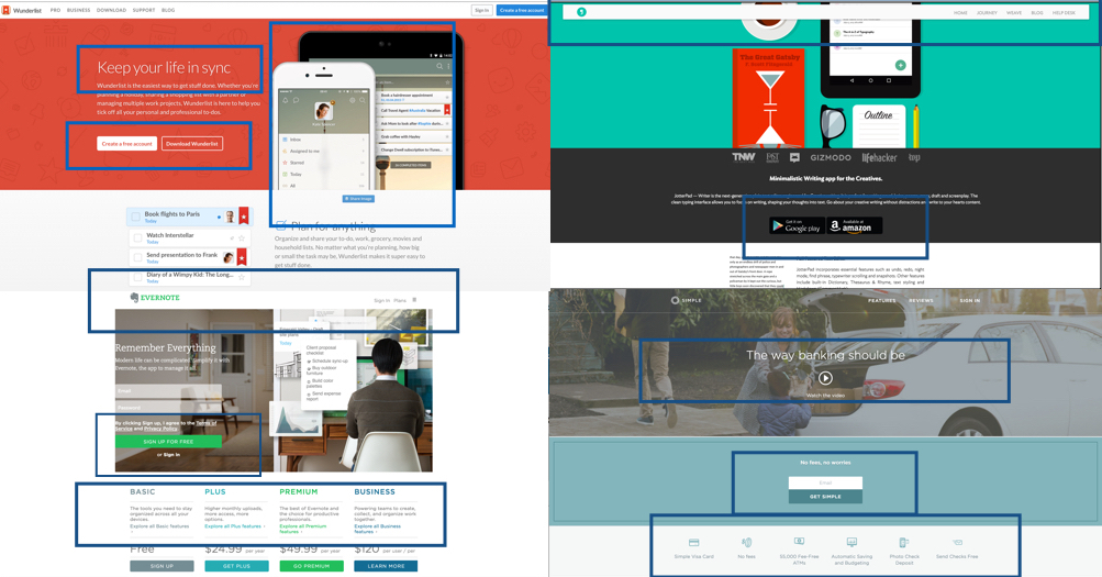
I next had to understand what elements needed to be included on my page. Further I had to know how these elements would be organized. I did a thorough competitive analysis, understanding how related companies were promoting their productivity apps and inviting users to click on their call-to-action buttons. The most effective features were:
- Light and simple text
- Immediately visible call-to-action button
- One central sales pitch phrase
- Using icons to demonstrate application feature
- Repetition of the call-to-action button at the end of the page
- Animated elements
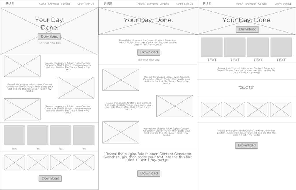
STAYING ORGANIZED
After a series of wireframes, I settled on an order I felt was appropriate. I made sure that any content only provided the most essential information to allow the user to swiftly move through the landing page.
I created a visual mockup of the site to prepare for user testing.
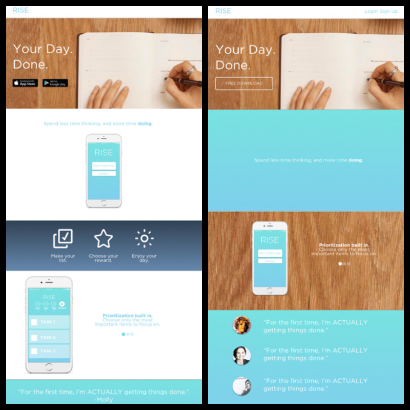
SIMPLE ENOUGH?
After a series of user tests, several adjustments were made:
- Reducing white space
- Including more of the base texture throughout the design
- Simpler color scheme
- Reducing extraneous visual elements
BOOTSTRAPPING IN
Having had experience in HTML and CSS in the past, I wanted to explore using front-end frameworks. I decided to work with Twitter Bootstrap for it’s built-in grid system. My visual mockup already followed the same grid, so it was easy to code this design.
BREATHING LIFE INTO AN OTHERWISE DEAD PAGE
With the landing page set up in HTML and CSS, it still felt a little lifeless. I decided to change the photo banner to a video (which I filmed), and added animation to the opening text. These elements worked to highlight the idea that this application would help a user become more productive.
I also changed the color scheme to a monochromatic look, again emphasizing the simplicity of the app.

VIEW THE FINAL LANDING PAGE BELOW
DESKTOP VIEW RECOMMENDED
FUTURE CONSIDERATIONS
It was my first time working with the Twitter Bootstrap framework. Although convenient in some areas, it was definitely a challenge in going through the existing CSS and modifying particular elements. Further trying to incorporate custom video and Javascript became a bit buggy on the responsive end of things. I’d like to explore other frameworks such as Foundation in future projects, to see what results I can achieve.